The Life of a Typographer by Alan Kitching.

Throughout my study in this MA, I have encounter various new methods of research and enquiry. One of which that I find most useful is Google Alerts. I have set up a variety of google alerts for the purpose of this course. I was recently alerted of an article by Alan Kitching, world-renowned typographer, designer and letterpress. The article promotes his book: A-Z of Letterpress, as well as exploring his design methods. This article, in turn lead me to further explorations of the artist.

letterpress-1
Alan Kitching’s A-Z of Letterpress (Image Source: http://cdn.pentagram.online/pentagram-com/uploads/Letterpress-1.jpg)

I am empathetic to Kitching’s method; he speaks about the importance of the”the physical process of printing” (Kitching, 2016). I discovered during the process of my FAT2 project, that I feel the hands-on, physical process of my own design process is key to the development of my ideas to their fullest potential. In addition, I find this method thoroughly enjoyable.


xedition-print-2012-pagespeed-ic-rpxysd1zor
Alan Kitching (Image Source: http://www.femalefirst.co.uk/books/alan-kitching-a-z-of-letter-press-935669.html)


Kitching proclaim; “With all my work I try to find the logic behind each decision” (Kitching, 2016). As with most designers, this is another of Kitching’s philosophies that I can relate to. I feel in order to be satisfied with my design work, I must aim to ensure a logicial explanation behind my typographic and design decisions.

Kitching is currently exhibiting at Pick Me Up at Somerset House in London.


kevin-meredith-16-04-20-5d-mrk3-1861-1024x683
Alan Kitching: A Life in Letterpress Exhibition (Image Source: http://www.creativereview.co.uk/cr-blog/2016/april/alan-kitching-a-life-in-letterpress-exhibition/)


kevin-meredith-16-04-20-5d-mrk3-1863-1024x613
Pick Me Up 2016 at Somerset House (Image Source: http://www.creativereview.co.uk/cr-blog/2016/april/alan-kitching-a-life-in-letterpress-exhibition/)


Resources:
Kitching, A. (2016) The Life of a Typographer by Alan Kitching.
Available at: http://www.femalefirst.co.uk/books/alan-kitching-a-z-of-letter-press-935669.html [Accessed 18 April 2016]

Pires, C. (2016) ‘A-Z living: An Inside Look at Typographer Alan Kitching’s Home’, written for The Guardian on Saturday 2 April 2016. Reproduced at: http://www.theguardian.com/lifeandstyle/2016/apr/02/a-z-living-typographer-alan-kitching-home-letterpress. [Accessed 18 April 2016]

Available at: Sinclair, M. (2016) Alan Kitching: A Life in Letterpress Exhibition
http://www.creativereview.co.uk/cr-blog/2016/april/alan-kitching-a-life-in-letterpress-exhibition/ [Accessed 21 April 2016]
Stefan Sagmeister – Things I have Learned in my Life so Far.

This is my first blog-post; a journey of research and development that will accompany my MA. I decided to focus this post on a graphic designer whose work has always been of interest to me: Stefan Sagmeister.

Austrian born, Stefan Sagmeister (1962) is a graphic designer and typographer currently based in New York. His work is fresh, innovative and often undertaken away from the computer with interesting and dynamic results. He is known for his unconventional approaches to graphic design.

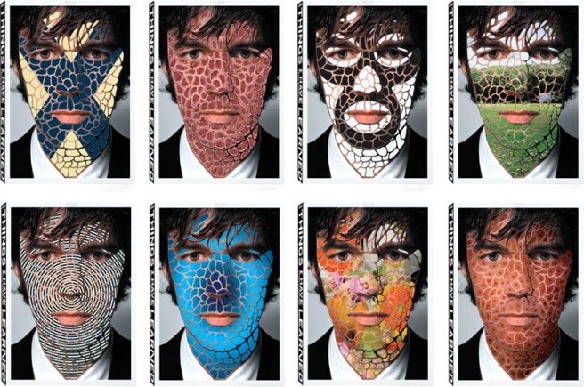
2013-05-22-kisalala-stefan-sagmeister-covers
The many alternative covers of Things I have Learned in my Life so Far by Stefan Sagmeister, (2006). Image Source: http://images.huffingtonpost.com/2013-05-22-kisalala-stefan-sagmeister-covers.jpg

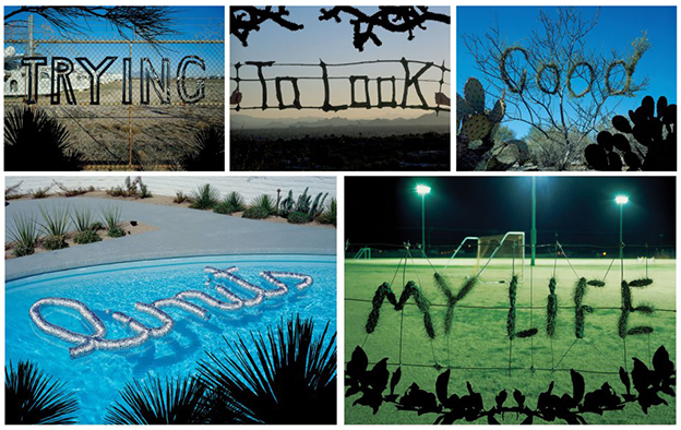
His book Things I have Learned in my Life so Far was published in 2006. The book originated from observations recorded by Sagmeister in his diaries. These resulted in a series of life lessons, which he conveys in a creative typographic manner. He created the lettering from natural and man-made materials and placed them in various novel environments. This approach to lettering is described as ‘metaphoric lettering’; letters that are “imbued with symbolism and serve as a vessel and as an idea” (Heller, S & Vienne V, 2012, p.38). Besides its visual appeal, the metaphoric lettering adds deeper meaning and a visual dynamic to the page.

https://99designs.com/designer-blog/wp-content/uploads/2013/12/TryingToLookGood.jpg
‘Trying to look good limits my life’, excerpt from Sagmeister’s book, ‘Things I have Learned in my Life so Far’. Image Source: https://99designs.com/designer-blog/wp-content/uploads/2013/12/TryingToLookGood.jpg

Book design is my main area of interest for my MA. I aim to explore the intersection and interaction of type and other visuals, in books or editorial design. In his book, Sagmeister creates unique lettering, and displays it interactively in a natural or related environment.

In this technological age, Sagmeister’s approach to this project is fresh, fun and visually appealing. I hope through the course of this MA, I can bring some of Sagmeister’s blended approach to my own work; where fine art and design take a significant role alongside more technological methods.

Resources:
Heller, Steven & Vienne Véronique, (2012) 100 Ideas that Changed Graphic Design. London: Laurence King. p.38