My Work – Shooting Star

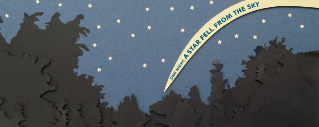
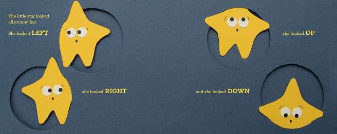
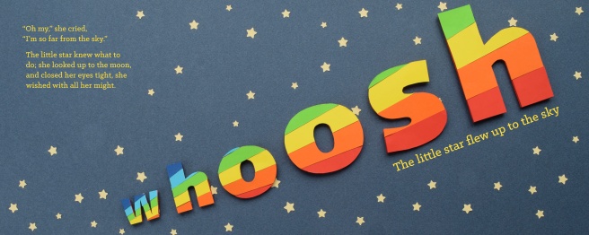
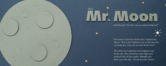
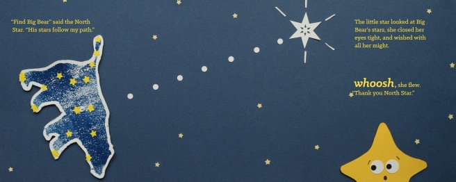
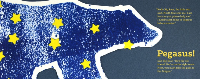
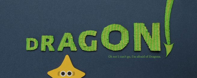
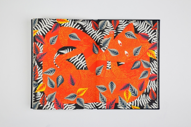
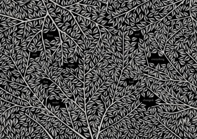
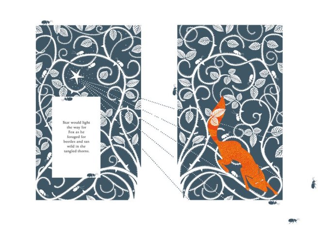
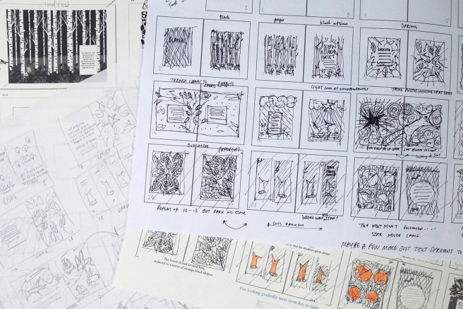
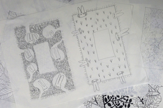
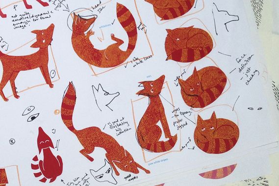
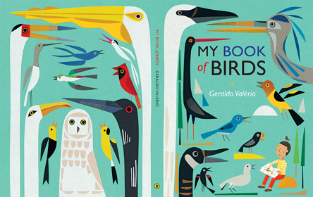
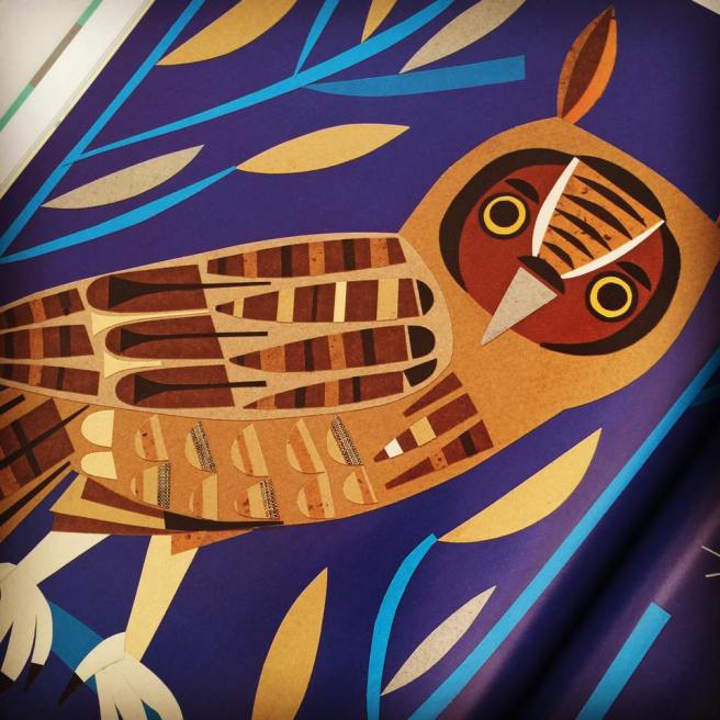
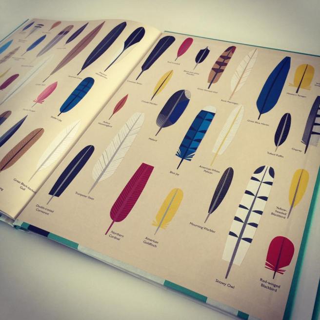
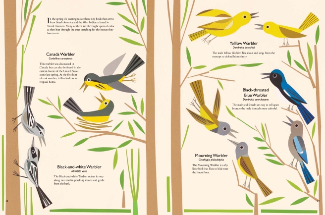
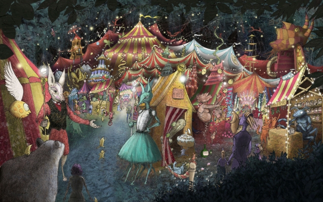
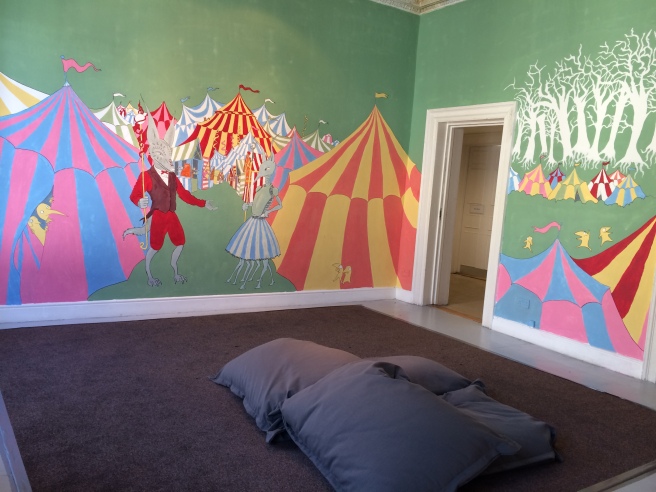
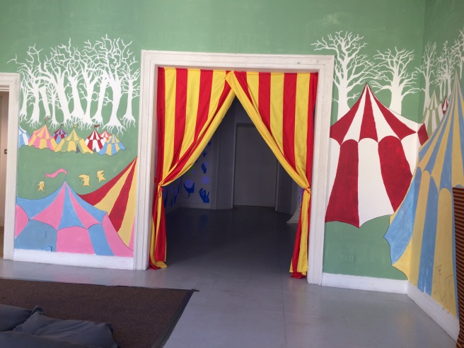
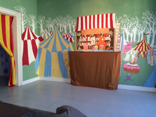
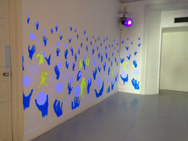
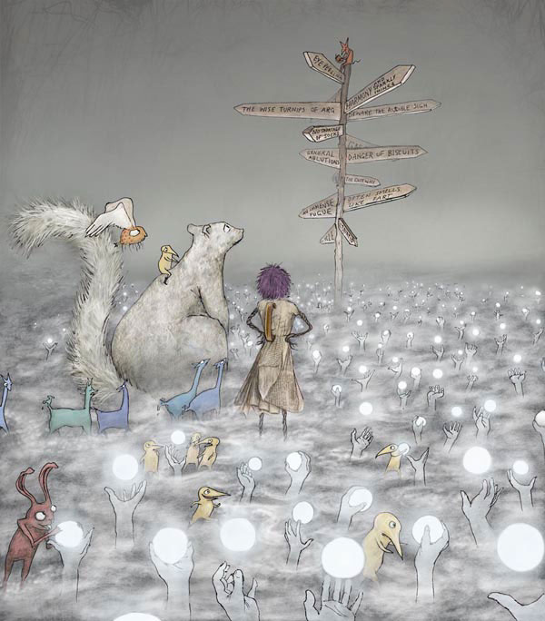
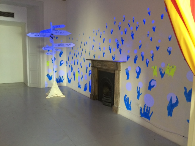
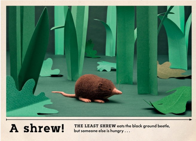
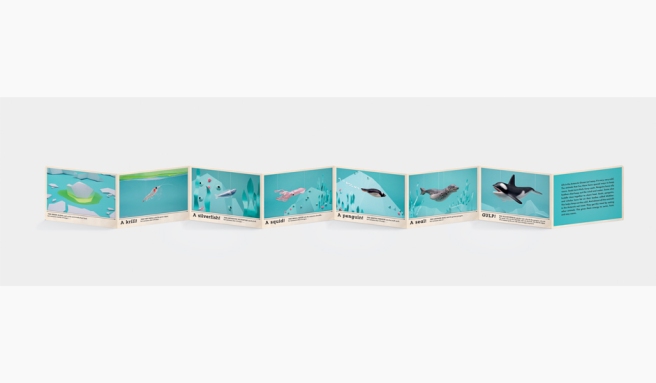
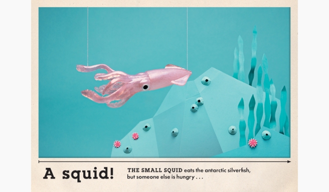
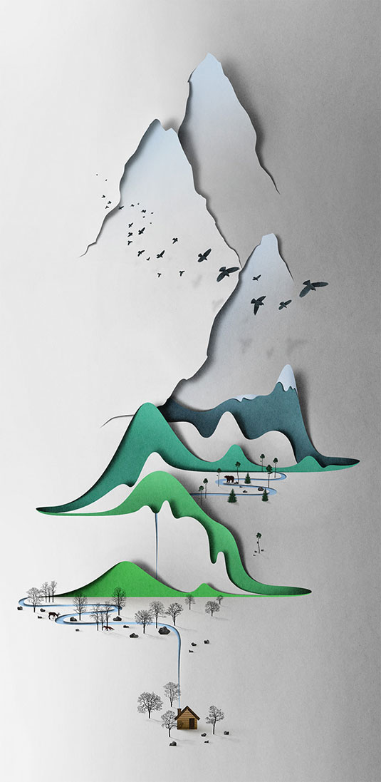
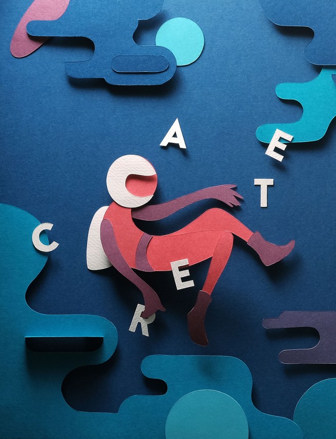
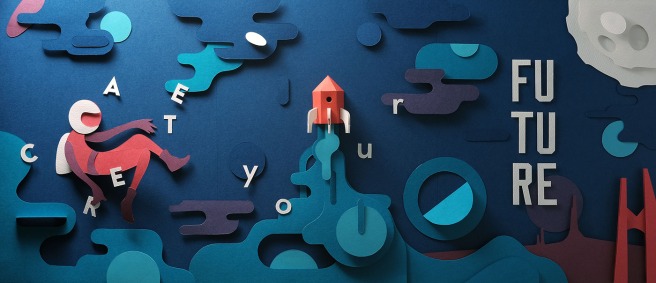
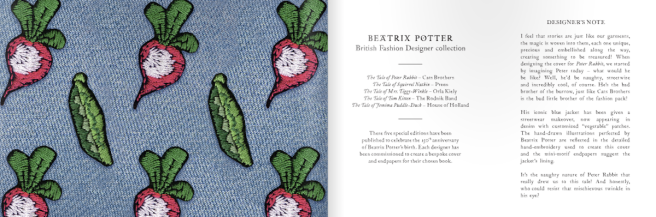
In order to establish a ground for moving forward, I find it beneficial to reflect on my recent work. Below are a series of spread from a children’s book that I have written and designed, as part of my current MA. The book remains unfinished at this stage, but it is my aim to continue with this project for my major study next year.

The book is made entirely out of paper and prints, with additional text set in InDesign. I thoroughly enjoyed the process of making this book. The physical process of using paper or making prints to create my designs allowed me to engage with the work and offered me the liberty to explore new ideas. As a result, my work has evolved. The finished artwork evokes a lively and tactile appearance, and in my opinion, appears less stagnant than my
previous work.

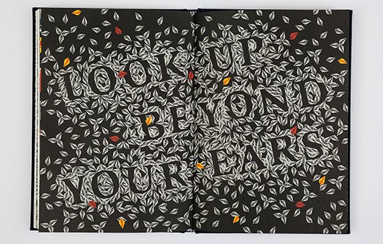
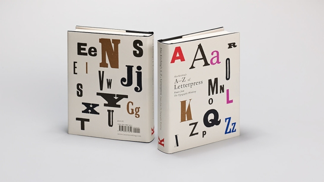
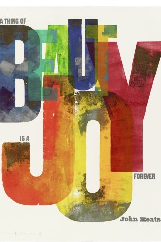
In particular, I enjoyed making the type in the book. Hand-crafting elements of the type in my updated project, allowed me to enhance the typography, assisting me to add semiotic meaning to the typography. By utilising the typography in my book, it gave me the potential to conjure emotions and feelings that represent a connotative meaning (Hassett & Curwood, 2009, p. 271).

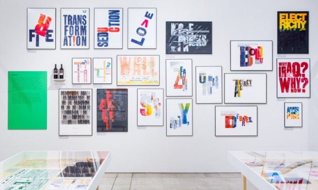
The development of the typography in my FAT2 project has enticed me to explore
type as vessel for both linguist and visual communication. Austrian-born designer,
Stefan Sagmeister, well known for his use of metaphoric lettering, creates designs
that are “imbued with symbolism and served as vessel and as idea” (Heller & Vienne,
2012. p.38). The use of metaphoric lettering adds deeper understanding of message
portrayed by the designer.

It is my aim to explore metaphoric lettering for my Practice 2 module. I hope that this
study will lay the groundwork for my major study.

Edel-McMahon---FAT2---Book-1
McMahon, E. (2016) Shooting Star (page 2+3)
Edel-McMahon---FAT2---Book-2
McMahon, E. (2016) Shooting Star (page 6+7)
Edel-McMahon---FAT2---Book-3
McMahon, E. (2016) Shooting Star (page 8+9)
Edel-McMahon---FAT2---Book-4
McMahon, E. (2016) Shooting Star (page 10+11)
Edel-McMahon---FAT2---Book-5
McMahon, E. (2016) Shooting Star (page 14+15)
Edel-McMahon---FAT2---Book-6
McMahon, E. (2016) Shooting Star (page 16+17
Edel-McMahon---FAT2---Book-7
McMahon, E. (2016) Shooting Star (page 18+19)

Resources:
Hassett, D.D. & Curwood, J.S. (2009) “Theories and Practices of Multimodal
Education: The Instructional Dynamics of Picture Books and Primary Classrooms”,
The Reading Teacher, vol. 63, no. 4, pp. 270-282.

Heller, S. & Vienne, V. (2012) 100 Ideas that Changed Graphic Design. London:
Laurence King. p.38

The Fox and the Star by Coralie Bickford-Smith

Google Alert once again directed me to another new artist; Coralie Bickford-Smith’s.  I was instantly drawn to Coralie Bickford-Smith’s illustrations in The Fox and the Star. Coralie Bickford-Smith is an established book designer at Penguin Random House. The Fox and the Star is her debut book as author/illustrator.

The Fox and the Star is a tale of love, loss and self-discovery beautifully illustrated over  64 pages. Throughout the book, Bickford-Smith uses pattern, colour and shape elegantly to inform her reader. Even with a restricted palette of only five Pantone Colours, Bickford-Smith creates a world of colour and at times, to fit the story, a world of darkness.


static1.squarespace.com
Coralie Bickford-Smith (2015) ‘The Fox and the Star’ (Size: Hard back – 253mm x 185mm, 64 highly illustrated pages) (Image source: http://cb-smith.com/the-fox-and-the-star/)

static1.squarespace.com
The Fox and the Star (Image Source: http://cb-smith.com/the-fox-and-the-star/)

I was intrigued by the typographic spread of the book; a playful and inspiring approach.

00073368-550x350
Coralie Bickford-Smith, The Fox and the Star (Image Source: https://www.waterstones.com/book/the-fox-and-the-star/coralie-bickford-smith/9781846148507)

I admire the way in which Bickford-Smith has broken up the typography throughout the book. The spread below is a successful example of this.

4182
Coralie Bickford-Smith, ‘The Fox and the Star’ (Image source: http://www.theguardian.com/childrens-books-site/gallery/2015/dec/01/the-fox-and-the-star-waterstones-book-of-the-year-2015)


Bickford-Smith creates a sense of playfulness by allowing her illustrations to break the margins of the page.41821

Bickford-Smith cites the British book designer,  William Morris, as a source of inspiration for her illustrations. Morris was a key figure in the Arts & Crafts Movement (1880 – 1910). He is well known for his decorative patterns and floral artworks.

3037870-inline-i-3-an-ipad-app-inspired-by-victorian-pattern-designer-william-morris
William Morris, (1883) ‘Strawberry Thief’ Victoria and Albert Museum:London (Image source: http://d.fastcompany.net/multisite_files/fastcompany/imagecache/inline-large/inline/2014/10/3037870-inline-i-3-an-ipad-app-inspired-by-victorian-pattern-designer-william-morris.jpg)


william-morris-_18_1816738i
William Morris (1834-1896). Design for a printed textile: ‘Wey’, 1882-3. Pencil and watercolour heightened with white bodycolour on paper (Image source: http://i.telegraph.co.uk/multimedia/archive/01816/William-Morris-_18_1816738i.jpg)


layout_rough
Layout roughs for The Fox and the Star (Image Source: https://www.creativereview.co.uk/cr-blog/2015/september/the-fox-and-the-star-by-coralie-bickford-smith/)

I am always intrigued by another artists design process and rough drawings and sketches.

spreads_rough
Layout roughs for The Fox and the Star (Image Source: https://www.creativereview.co.uk/cr-blog/2015/september/the-fox-and-the-star-by-coralie-bickford-smith/)


ba296312fb14f21ddd4efe1799a6126c
Sketches for the fox (Image Source: https://www.creativereview.co.uk/cr-blog/2015/september/the-fox-and-the-star-by-coralie-bickford-smith/)


Resources:
Lehman, T. (2016) Coralie Bickford-Smith discusses the secret to successful books covers
http://www.femalefirst.co.uk/books/coralie-bickford-smith-penguin-random-house-946985.html [Accessed: 17 May 16]

Coralie Bickford-Smith (2015) The Fox and the Star
Available at: http://cb-smith.com/the-fox-and-the-star/ [Accessed: 17 May 16]

Sinclair, M. (2015) The Fox and the Star by Coralie Bickford-Smith. Available at: https://www.creativereview.co.uk/cr-blog/2015/september/the-fox-and-the-star-by-coralie-bickford-smith/ [Accessed: 17 May 16]

(2015) The Fox and the Star – in pictures. Available at: http://www.theguardian.com/childrens-books-site/gallery/2015/dec/01/the-fox-and-the-star-waterstones-book-of-the-year-2015 [Accessed: 17 May 16]


My Book of Birds by Geraldo Valério

I came across of this artist on Twitter, Geraldo Valério. His book is filled with vibrant and quirky illustrations. The book is published by Groundwood Books, an independent Canadian children’s publisher based in Toronto.

I was drawn to Valério use of collage, layers and geometric shapes. His style is reflective of paper-cut illustrations.

my-book-of-birds_cover_sm
My Book of Birds by Geraldo Valério (Image Source: http://www.geraldovalerio.com/images/MyBookOfBirds_images/My-Book-of-Birds_COVER_sm.jpg)


13087711_10153995458520446_4572746526721240251_n
Geraldo Valério (Image Source: https://picturebooksblogger.wordpress.com/2016/04/23/birds/)


13094427_10153995458540446_3236498976683138321_n
Geraldo Valério (Image Source: https://picturebooksblogger.wordpress.com/2016/04/23/birds/)


mybookofbirds_interimpages-30
My Book of Birds by Geraldo Valério (Image Source: http://groundwoodbooks.com/wp-content/uploads/2016/04/MyBookOfBirds_InterimPages-30.jpg)

Resources:
Picture Books Blogger (2016) My Book Of Birds by Geraldo Valério. Available at: https://picturebooksblogger.wordpress.com/2016/04/23/birds/ [Accessed: 23 April 2016]

Groundwood Books
Available at: http://groundwoodbooks.com/ [Accessed: 23 April 2016]

Exhibition: Shona Shirley MacDonald – Juniper

In association with Cúirt International Festival of Literature, Galway Arts Centre presents ‘Juniper’ a solo exhibition by artist and illustrator Shona Shirley MacDonald, running from Monday 18th – Saturday 23rd April 2016.
The exhibition features magical illustrations on the ground floor, an additional illustration on the stairway leads you upstairs, where Macdonald has transformed Galway Arts Centre into a real-life version of her artworks.

MacDonald was commissioned by Cúirt for this installation for Cúirt Labs – the festival’s programme for Children and young people (Galway Arts Centre, 2016).

a1525118736383-562ce6c5be0fb
Macdonald, S. (2014) ‘The Night Circus’, Archival Pigment Print on Cotton Rag Acid-free Paper, exhibited as part of ‘Juniper’ in the Galway Arts Centre (2016) (Image source: https://mir-s3-cdn-cf.behance.net/project_modules/max_1200/a1525118736383.562ce6c5be0fb.jpg)
IMG_2791
Shona Shirley Macdonald, (2016) Juniper. Galway Arts Centre: Galway.


IMG_2792
Shona Shirley Macdonald, (2016) Juniper. Galway Arts Centre: Galway.


IMG_2794
Shona Shirley Macdonald, (2016) Juniper. Galway Arts Centre: Galway.

In relation to my own work, I found this exhibition visit very inspirational. I was particularly drawn to the installation space upstairs. I began to reflect my own project and the workshop that I aim designing. I found the use of glow in the dark, neon, paint very intriging. As my project is based on stars and the night sky, fluorescent paint could be useful to reflect the night sky. I have decided to experiment with the idea of integrating glow-in-the-dark paint and glow-in-the-dark stars into my workshop.

I was drawn to the transformation of the upstairs space into a representation of the artwork, and as an interactive space for children. I feel my workshop could benefit from such a transformation of space to represent my book.

IMG_2796
Shona Shirley Macdonald, (2016) Juniper. Galway Arts Centre: Galway.
3bdbe915638565-56295205b8531
Macdonald, S. (2011) ‘The Glowing Field of Confounding Fruit’ Archival Pigment Print on Cotton Rag Acid-free Paper, exhibited as part of ‘Juniper’ in the Galway Arts Centre (Image source: https://mir-s3-cdn-cf.behance.net/project_modules/disp/3bdbe915638565.56295205b8531.jpg)


IMG_2795
Shona Shirley Macdonald, (2016) Juniper. Galway Arts Centre: Galway.


Resources:
Galway Arts Centre (2016) Juniper a Solo Exhibition by Shona Shirley MacDonald.
Available at: https://www.galwayartscentre.ie/exhibitions/72-juniper-a-solo-exhibition-by-shona-shirley-macdonald [Accessed: 21st April 2016]

Shona Shirley Macdonald
Available at: http://www.shonashirleymacdonald.com [Accessed: 21st April 2016]

Chrissie Macdonald – Offset

I saw Chrissie Macdonald speak at Offset 2015. At the time her work really appealed to me, I decided to revisit her work with my current project in mind.

Chrissie Macdonald, is a London-based illustrator, maker and art director. Macdonald is also a part of Peepshow Collective, an award winning studio specialising in animation, art-direction and illustration. Macdonald takes an analogue hands on approach to her work, creating 3D images with paper, fabric and other materials.


e267d1ef4cd61011853f17ce1a059561
Edinburgh Fringe-Festival Poster by Chrissie Macdonald (Image source: http://www.chrissiemacdonald.co.uk/Edinburgh-Fringe-Festival)


cr-shredder
Chrissie Macdonald. ‘Paper Shredder’. Image showcasing a range of paper stocks for Creative Review (Image Source: http://payload50.cargocollective.com/1/7/235058/3303877/CR-Shredder.jpg)


Resources:
Chrissie Macdonald – Offset 2015
Available at: https://vimeo.com/134390805
[Date Accessed: 23 Jan 2016]

Chrissie Macdonald Website
Available at: http://www.chrissiemacdonald.co.uk/
[Date Accessed: 23 Jan 2016]

Gosling, E. (2015) Chrissie Macdonald talks creative “support groups” and never giving up
Available at: http://www.itsnicethat.com/articles/chrissie-macdonald-offset
[Date Accessed: 23 Jan 2016]

Animals Are Delicious

Animals Are Delicious
by Sarah Hutt, illustrated by Dave Ladd and Stephanie Anderson


Screen Shot 2016-04-12 at 16.44.49
‘Animals Are Delicious’, illustrated by Dave Ladd and Stephanie Anderson (Image Source: http://de.phaidon.com/store/childrens-books/animals-are-delicious-9780714871448/)

Animals are Delicious is a children’s book written by Sarah Hutt and illustrated by Dave Ladd and Stephanie Anderson. Ladd and Anderson are a husband-and-wife team with a background  in illustration and design. The book is a non-fiction aimed to 2 to 4 years old and is a board book presented as three accordion-foldout. Each chain stretches
out to 6 feet long when unfolded, Offering a hands on interactive book for the child.

The design and illustration is playful in its approach. It features custom-made animal in figurines and paper made diorama-like sets.

9780714871233-product-4
‘Animals Are Delicious’, illustrated by Dave Ladd and Stephanie Anderson (Image Source: http://www.phaidon.com/resource/9780714871233-product-4.jpg)


9780714871233-product-3
‘Animals Are Delicious’ illustrated by Dave Ladd and Stephanie Anderson (Image Source: http://www.phaidon.com/resource/9780714871233-product-3.jpg)

Format: Hardback
Size: 228 x 165 mm, 9 x 9 in
Pages: 48 pp
Number of Colour Illustrations: 24

Resources:
Burnett, M. (2016) A Visit to Phaidon’s Children’s Department
Available at: http://www.publishersweekly.com/pw/by-topic/childrens/childrens-industry-news/article/69481-a-visit-to-phaidon-s-children-s-department.html [Accessed: 19th April 2016]

Phaidon (2016) Phaidon Children’s Books Catalogue
Available at: http://www.phaidon.com/resource/ws16-childrenscatalog-us.pdf [Accessed: 19th April 2016]

Phaidon (2016) Phaidon Announces Expanded Children’s Book Program for Spring 2016. Available at: http://www.prnewswire.com/news-releases/phaidon-announces-expanded-childrens-book-program-for-spring-2016-300224790.html [Accessed: 19th April 2016]


Eiko Ojala

Eiko Ojala is an Estonian illustrator. Ojala’s work has the appearance of paper cut illustration but is created digitally. Ojala draws everything by hand, landscapes, figures and portraits. The final illustration appears to have been made with paper. Ojala’s use of life like shadows give his work a tactile quality.

fullpaper
Eiko Ojala, ‘Vertical Landscape’ (Image Source: http://www.creativebloq.com/illustration/hand-cut-paper-illustrations-are-perfect-inspiration-3132167)


Resources:
Creative Bloq (2013) Hand-cut paper illustrations show a world of detail
Available at: http://www.creativebloq.com/illustration/hand-cut-paper-illustrations-are-perfect-inspiration-3132167
[Accessed: 28 January 2016]

The Life of a Typographer by Alan Kitching.

Throughout my study in this MA, I have encounter various new methods of research and enquiry. One of which that I find most useful is Google Alerts. I have set up a variety of google alerts for the purpose of this course. I was recently alerted of an article by Alan Kitching, world-renowned typographer, designer and letterpress. The article promotes his book: A-Z of Letterpress, as well as exploring his design methods. This article, in turn lead me to further explorations of the artist.

letterpress-1
Alan Kitching’s A-Z of Letterpress (Image Source: http://cdn.pentagram.online/pentagram-com/uploads/Letterpress-1.jpg)

I am empathetic to Kitching’s method; he speaks about the importance of the”the physical process of printing” (Kitching, 2016). I discovered during the process of my FAT2 project, that I feel the hands-on, physical process of my own design process is key to the development of my ideas to their fullest potential. In addition, I find this method thoroughly enjoyable.


xedition-print-2012-pagespeed-ic-rpxysd1zor
Alan Kitching (Image Source: http://www.femalefirst.co.uk/books/alan-kitching-a-z-of-letter-press-935669.html)


Kitching proclaim; “With all my work I try to find the logic behind each decision” (Kitching, 2016). As with most designers, this is another of Kitching’s philosophies that I can relate to. I feel in order to be satisfied with my design work, I must aim to ensure a logicial explanation behind my typographic and design decisions.

Kitching is currently exhibiting at Pick Me Up at Somerset House in London.


kevin-meredith-16-04-20-5d-mrk3-1861-1024x683
Alan Kitching: A Life in Letterpress Exhibition (Image Source: http://www.creativereview.co.uk/cr-blog/2016/april/alan-kitching-a-life-in-letterpress-exhibition/)


kevin-meredith-16-04-20-5d-mrk3-1863-1024x613
Pick Me Up 2016 at Somerset House (Image Source: http://www.creativereview.co.uk/cr-blog/2016/april/alan-kitching-a-life-in-letterpress-exhibition/)


Resources:
Kitching, A. (2016) The Life of a Typographer by Alan Kitching.
Available at: http://www.femalefirst.co.uk/books/alan-kitching-a-z-of-letter-press-935669.html [Accessed 18 April 2016]

Pires, C. (2016) ‘A-Z living: An Inside Look at Typographer Alan Kitching’s Home’, written for The Guardian on Saturday 2 April 2016. Reproduced at: http://www.theguardian.com/lifeandstyle/2016/apr/02/a-z-living-typographer-alan-kitching-home-letterpress. [Accessed 18 April 2016]

Available at: Sinclair, M. (2016) Alan Kitching: A Life in Letterpress Exhibition
http://www.creativereview.co.uk/cr-blog/2016/april/alan-kitching-a-life-in-letterpress-exhibition/ [Accessed 21 April 2016]

John Ed De Vera, ‘Create Your Own Future’

191ea832493855-5686a7e38150c
John Ed De Vera, ‘Create your own Future’ (Image Source: https://mir-s3-cdn-cf.behance.net/project_modules/1400/191ea832493855.5686a7e38150c.jpg)

John Ed De Vera is a multidisciplinary designer. He created this editorial project ‘Create Your Own Future’ using layers of paper and folding techniques. Through the use of effective lighting, De Vera creates beautiful shadows and dimensionality within the piece. In particular, I am drawn to the interaction of the type with the image.

De Vera explains his work in a recent issue of Computer Arts, “It’s an analogue piece of work, but I wanted to create the art style and its execution … I drew basic shapes that are common in today’s infographic illustrations. Using paper as a medium allowed me to add layers and create depth and dimensions” (Computer Arts, 2016, p. 38).

61e3e632493855-5686a7e3835c4
John Ed De Vera, ‘Create your own Future’ material, 200gsm paper board, double sided foam tape, blu tack. (Image Source: https://mir-s3-cdn-cf.behance.net/project_modules/1400/191ea832493855.5686a7e38150c.jpg)


De Vera took inspiration from inventor Frank Walker (played by George Clooney) in the Disney film, Tomorrowland.(Computer Arts, 2016, p. 38). I have yet to see Tomorrowland, but seeing De Vera’s beautiful work I am curious to check out his inspiration.

Resources:
Computer Arts, (2016) ‘Showcase – Unfolding Tomorrow: Create your own Future’, in Computer Arts, March 2016, Issue #250, pp. 38

John Ed De Vera. Available at: https://johned.co/ [Accessed: 17 April 2016]

Sasso, F. (2016) Create your Future – Paper Craft. Available at: http://abduzeedo.com/create-your-future-paper-craft [Accessed: 17 April 2016]

Beatrix Potter Books get a Makeover

I came across this interesting article on Creative Review’s twitter feed (https://twitter.com/CreativeReview).

Penguin Random House present a new collection of the titles commissioned as part of celebration of 150 years since Beatrix Potter’s birth. Leading UK and Irish fashion designers including Henry Holland, Rodnik Band and Orla Keily were invited to re-imagine Potter’s book covers and endpapers.

bp4-1024x384
Beatrix Potter’s five new covers in the Fashion Designers Collection (Image Source: http://www.creativereview.co.uk/cr-blog/2016/april/beatrix-potter-books-get-a-21st-century-makeover)


I found the designer’s note (image below) particularly interesting.

bp5
The Tale of Peter Rabbit by luxury knitwear/street-wear label Cats Brothers (Image Source: http://www.creativereview.co.uk/cr-blog/2016/april/beatrix-potter-books-get-a-21st-century-makeover/)

In contrast to Creative Review’s positive response to the make-over of Beatrix Potter’s book, Harriet Brown, writer for The Guardain newspaper, is baffled by the necessity to alter classic designs, she writes,

“However, far from paying tribute to the delicate illustrations that make the likes of Peter Rabbit and Mrs Tiggy Winkle so charming, these brash and bold new covers remove the classic illustrations almost completely, replacing them with modern “edgy” covers, aiming to make the books seem cool” (Brown, 2016).

While Brown admits that the reproduction themselves are “nice designs” (Brown, 2016), she argues that the misrepresent the core elements of Beatrix Potter’s characters. Brown claims that the designers and illustrators tried to make Beatrix Potter’s characters ‘cool’, “For many people, Beatrix Potter’s tales of talking mice and bonnet-wearing puddle-ducks were integral and treasured parts of growing up, tied up with fond memories of early reading and innocence” (Brown, 2016).

It should be noted that these redesigns are solely for the covers of Potter’s books. The original illustrations remains intact behind the new look.

Brown put forth a strong convincing argument, “That’s not a celebration of their success. It seems that these days nothing can get away with growing old gracefully” (Brown, 2016).

While on one level I agree with Brown’s argument, I find the redesigns very intriguing. The designers were asked to re-imagine the cover in their own context and I feel they were successful executed. Is it as Brown suggests a marketing exercise aimed to increase the sales of Potter’s books. She poses the question: “who will these books actually appeal to?” (Brown, 2016), and here she has a point. They may not appeal to Potter’s fans. They may not appeal to young children. Are  these books designed for designers and artists or those interested in the arts?

Brown concludes, “It  [the redesign of these books] messes with their nostalgic appeal and hides the beautiful illustrations that make her so worthy of a whole year of celebrations in the first place”(Brown, 2016). I wonder what would Beatrix Potter say?

Resources:
Brown, H. (2016) ‘Leave Peter Rabbit Alone!’, originally written for The Guardian, Friday 15 April 2016. Reproduced at:http://www.theguardian.com/childrens-books-site/2016/apr/15/leave-peter-rabbit-alone [Accessed: 15 April 2016]

Williams, E. (2016) Beatrix Potter Books get a 21st Century Makeover
Available at: http://www.creativereview.co.uk/cr-blog/2016/april/beatrix-potter-books-get-a-21st-century-makeover/ [Accessed: 13 April 2016]