‘UNDERGROUND IMAGES’ , a traveling exhibition, is currently being hosted at the Centre for Creative Arts and Media, Galway-Mayo Institute of Technology, Galway, Ireland
from March 2 – April 8, 2016.
The exhibition includes large format posters conceived at the School of Visual Arts for display in the New York City subway system. Curated by SVA Executive Vice President Anthony P. Rhodes, these images offer a glimpse of their acclaimed design, illustration and photography faculties from 1947 to present. Artists include Stefan Sagmeister, Steven Heller, Eve Sonneman and Robert Weaver.
Stefan Sagmeister, ‘SVA’ GMIT, Centre for Creative Arts & Media, Galway, (2016) Underground Images. Galway.
“Beginning in the mid-1950s, SVA was in the vanguard of academic institutions in the U.S. to recognize the need for alternative marketing strategies to attract new students. SVA took to the platforms of New York City’s subway with advertising posters that were both thought-provoking and eye-catching, featuring the work of legendary artists like Ivan Chermayeff, Milton Glaser and George Tscherny. All practicing professionals on the faculty at SVA, they used the poster commission to explore what it means to be an artist and hone their own artistic voice. Like the College itself, the SVA subway posters have become in some way inseparable from the city as incitements to creativity and risk taking” (Underground Images).
Milton Glaser (1967) ‘Doors’ GMIT, Centre for Creative Arts & Media, Galway, (2016) Underground Images. Galway.
Stefan Sagmeister (2004) ‘Thinking Life Will be Better in the Future is Stupid. I have to live now.’ GMIT, Centre for Creative Arts & Media, Galway, (2016) Underground Images. Galway.
Gail Anderson, (2008) “If someone says you shouldn’t, ask them who should.” GMIT, Centre for Creative Arts & Media, Galway, (2016) Underground Images. Galway.Louise Fili, (2011) “It’s never too late to get where you’re going.” GMIT, Centre for Creative Arts & Media, Galway, (2016) Underground Images. Galway.
The work of Chip Kidd was first introduced in 2005, during my early years studying graphic design. At the time, I was researching for a project that explored influential book designers; inevitably Kidd appeared on this list. A recent post on StudyNet prompted me to revisit his work.
Chip Kidd (2012) TED Talk: Designing Books is No Laughing Matter. OK it is?
Chip Kidd is an influential American graphic designer, best known for the many book covers and jackets he has designed. In the book, Anatomy of Design: Uncovering the Influences and Inspiration in Modern Graphic Design, by Steven Heller & Mirko Ilic, Kidd is described as being “known for pushing the proverbial boundaries of book jacket design – from purely illustrative to conceptually pictorial and typographical” (Heller & Ilic, 2009, p. 41).
I have always been interested in book-cover design. In this video, Kidd deals with the main issue that I had highlighted in my original statement for this MA – the future of the book in relation to the effects of new technology. Kidd is an advocate of the printed book, he describes himself as a “book designer, page turner, dog-eared place holder, notes in the margins taker, ink sniffer” (Kidd, 2012).
Kidd promotes the importance of the interaction between the reader and the book. Through our senses we touch, feel, and even smell a book to fully experience what it has to offer. He discusses the design of one of his book covers: My Name Is Red by Orhan Pamuk, the cover of the book tell a story when it is placed on a book shelf; it begins with the spine and continues with with the adjacent images used on the cover. Kidd proclaims “Try Experiencing that on a Kindle!” (Kidd, 2012), he argues that the cover invites the viewer to open the book and discover the story within.
Although Kidd claims that “much is to be gained by e-books: ease, convenience, portability” (Kidd, 2012), he argues that, “something is definitely lost: tradition, a sensual experience, the comfort of a thingyness” (Kidd, 2012).
Kidd discusses the importance of exploration, interaction, consideration and touch using the example of the book cover and jacket he designed for Haruki Murakami’s novel: 1Q84 . Kidd maintains that these elements are lost once the cover is translated into a digital format.
Book cover and Jacket, 1Q84, by Haruki Murakami. Image Source: Chip Kidd (2012) TED Talk: Designing Books is No Laughing Matter. OK it is?
This video lead me to a more recent TED Talk by Kidd, The Art of First Impressions – in Design and Life? (2015)
In this energetic talk, Kidd gives us an insight as to where his inspiration originates. He often looks to his everyday environments to inspire create and visually appealing artworks. In this TedTalk, he provides various examples of items that inspired him: pictures in the subway, signage in his office, graffiti, and even his own mouth.
In relation to my own practice, I found his approach motivating. We are often immune to the many features of our environment that could offer us the stimulus we need to create an artwork. This talk reminds us to open our eyes to our everyday surroundings.
Chip Kidd has a diverse style which is evident throughout the thousands of book covers that he has designed; using a combination of typography, photography and illustration, this can be seen from the small selection of Kidd’s book covers shown in the image above.
The Irish Museum of Modern Art (IMMA) are currently hosting an exhibition (30 July – 18 October 2015) that features the Russian avant-garde artist, architect and designer, El Lissitzky (1890 – 1941). This exhibition is a forerunner to the centenary commemoration of the Easter Rising (1916), following which Ireland subsequently gained independence. The exhibition El Lissitzky: The Artist and the State, explores the work of El Lissitzky, and contemporary artists, who have voiced a political message through their artworks.
The exhibition is being held in IMMA’s Garden Galleries. Spanning across three floors, it begins in the basement with a Futurist video: Victory Over the Sun. The costume and stage design was by the artist, Kasimir Malevich (1878 – 1935), who later founded the Suprematist art movement, and greatly influenced El Lissitzky.
The exhibition features a range of posters, book covers & hand-drawn proofs created by El Lissitzky. To my surprise, the second floor features two children’s books by El Lissitzky: About 2 Squares and The Four Fundamentals of Arithmetic. I found this room particularly inspiring and I could relate to it in terms of my own work. The simple imagery used in his children’s book produced dynamic layouts.
About 2 Squares was the artist’s first children’s book. It is a story about two squares, one red and one black; these two colours regularly feature in Lissitzky’s work. Heller & Vienne devote a chapter in his book, 100 Ideas that Changed Graphic Design, to this particular colour combination. The authors maintains that the result is a balanced combination; however he also argues that it was an aggressive duo in so far as “at the service of Soviet propaganda, red and black had demonstrated their pugnacious nature and versatility.” (Heller & Vienne, 2010, p.68). While red often represents danger, it can also be viewed as a symbol of power. This use of colour combination is evident in El Lissitzky’s famous political work: Beat the Whites with the Red Wedge (see image below).
El Lissitzky, ‘About 2 Squares’ (1922). IMMA, (2015) ‘El Lissitzky: The Artist and the State‘. Dublin.
El Lissitzky’s children’s book: The Four Fundamentals of Arithmetic, features geometric shapes, solid colours and type as an image in the form of characters created from a combination of letters. Lissitzky encourages the children to interact with the book, to act out the book with materials that is available to them. The literature provided at IMMA quotes El Lissitzky, “this is how to use letters to put together every kind of arithmetical method – try it yourself” (Irish Museum of Modern Art, 2015). The interactive aspect of El Lissitzky’s work appeals to me, in relation to the development of my own work. While interactive books are not a new concept today, viewing this exhibition renewed my ambition to review the possibilities for beneficial interaction between the reader and the book, the viewer and the artwork.
El Lissitzky, ‘The Four Fundamentals of Arithmetic’ (1928) reprint 1976 silkscreen on paper. IMMA, (2015) ‘El Lissitzky: The Artist and the State’. Dublin.
El Lissitzky continues to have a notable impact on both the design and art world. Rick Poyner, design-critic and author, notes in his book: No More Rules, Graphic Design and Postmodernism (2003), that “young designers constantly evoked the achievements of modernism leading lights…”(Poyner, 2013 p. 76). Rather than merely copying earlier designers, the new generation took “…a sense of dynamism, a sense humanism, and non-acceptance of traditional rules and values” (Poyner, p. 76). Poyner singles out the postmodern designers: Karl Kleflish, Neville Brody (see image below), and Malcom Garrett, as artists who drew heavily on El Lissitzky’s oeuvre.
Left: El Lissitzky, ‘Beat the Whites with the Red Wedge’ (1919-1920). Image Source: http://www.designishistory.com/1920/el-lissitzky. Right: Neville Brody. The Face, no. 23, magazine spread, UK , (1982) Image Source: (Poyner, 2013, p.75)
Resources: Heller, S. & Vienne, V. (2012) 100 Ideas That Changed Graphic Design. Laurence King, London, p.68.
Irish Museum of Modern Art (2015), El Lissitzky: The Artist and the State, exhibition catalogue, 30 July – 18 October 2015, Dublin: IMMA.
Poyner, Rick, (2013) No More Rules, Graphic Design and Postmoderism (Mini Edition). London: Laurence King, pp 70-77.
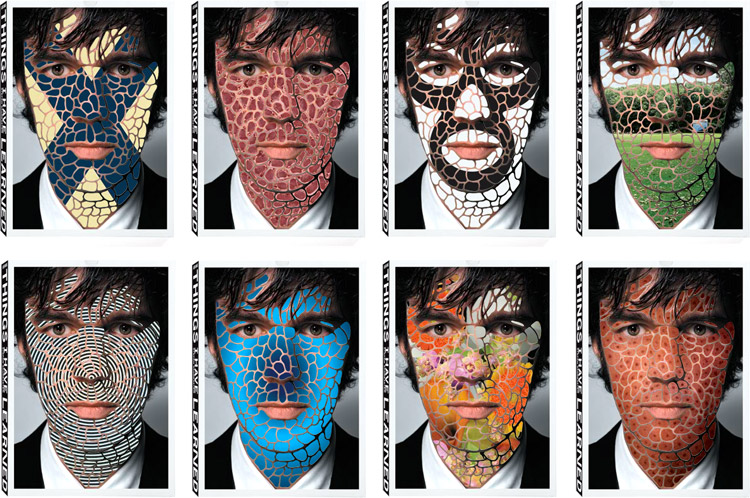
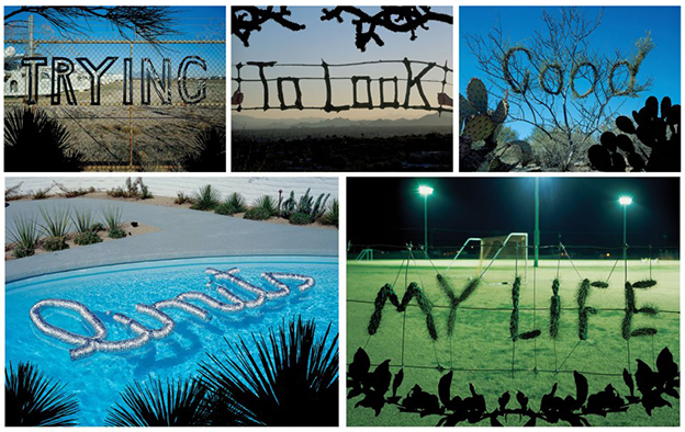
This is my first blog-post; a journey of research and development that will accompany my MA. I decided to focus this post on a graphic designer whose work has always been of interest to me: Stefan Sagmeister.
Austrian born, Stefan Sagmeister (1962) is a graphic designer and typographer currently based in New York. His work is fresh, innovative and often undertaken away from the computer with interesting and dynamic results. He is known for his unconventional approaches to graphic design.
His book Things I have Learned in my Life so Far was published in 2006. The book originated from observations recorded by Sagmeister in his diaries. These resulted in a series of life lessons, which he conveys in a creative typographic manner. He created the lettering from natural and man-made materials and placed them in various novel environments. This approach to lettering is described as ‘metaphoric lettering’; letters that are “imbued with symbolism and serve as a vessel and as an idea” (Heller, S & Vienne V, 2012, p.38). Besides its visual appeal, the metaphoric lettering adds deeper meaning and a visual dynamic to the page.
Book design is my main area of interest for my MA. I aim to explore the intersection and interaction of type and other visuals, in books or editorial design. In his book, Sagmeister creates unique lettering, and displays it interactively in a natural or related environment.
In this technological age, Sagmeister’s approach to this project is fresh, fun and visually appealing. I hope through the course of this MA, I can bring some of Sagmeister’s blended approach to my own work; where fine art and design take a significant role alongside more technological methods.
Resources:
Heller, Steven & Vienne Véronique, (2012) 100 Ideas that Changed Graphic Design. London: Laurence King. p.38


